Effective Infographics for Attracting Niche Audiences
The difference between ignored market analysis and viral trading content often comes down to the use of effective infographics in order to reinforce visualization. In today’s information-saturated trading world, capturing attention requires more than just accurate data—it demands visual presentation that resonates instantly with your target audience.
Traders process thousands of data points daily, making effective infographics not just helpful but essential for quick decision-making. Whether you’re a brokerage firm looking to attract new clients, an analyst building your following, or an educational platform teaching trading concepts, mastering the art of financial infographics can dramatically amplify your message’s impact while establishing credibility in your specific trading niche.
Key Takeaways on Effective Infographics For Niche Audiences
- Effective trading infographics can boost engagement by up to 650% compared to text-only content, making complex market data instantly digestible
- Color psychology plays a crucial role in trading visuals—blue conveys trust and stability while red and green align with traditional market indicators
- Successful trading infographics prioritize data accuracy and visual clarity over flashy designs that might confuse novice investors
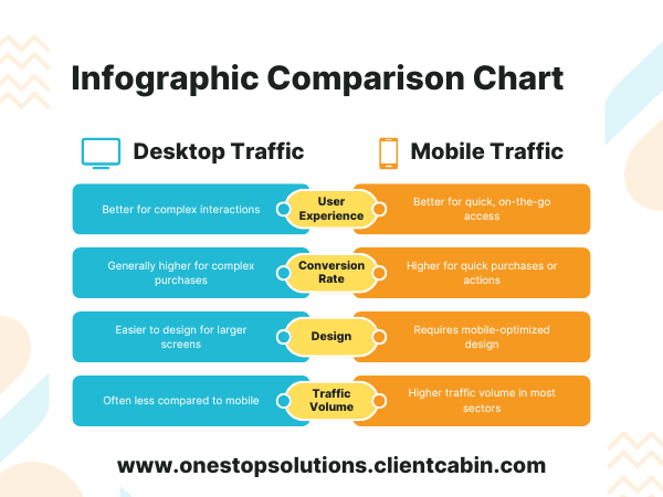
- Comparison charts and timeline visuals are particularly effective for illustrating market trends and potential entry/exit points
- The most shareable trading infographics focus on solving specific pain points for traders, such as pattern recognition or risk management strategies

Why Effective Infographics Captivate Niche Audiences
Trading is inherently visual—charts, patterns, and price movements all communicate through visual language. This makes traders particularly receptive to well-designed infographics that organize complex market information into digestible insights. The statistical advantage is clear: visual content is processed 60,000 times faster than text, giving infographic creators an immediate edge in the attention economy of financial markets.
Most trading platforms already use visualization as their core communication method, which means your audience is primed to absorb information this way. They’re trained to spot patterns and make decisions based on visual cues, creating a natural alignment between their information consumption habits and well-crafted and effective infographics.
“The best trading infographics don’t just present data—they tell visual stories that help traders see opportunities they might otherwise miss. When traders can literally see the pattern, their confidence in execution increases significantly.” — James Mackintosh, Market Analyst
Visual Processing Power: 60,000x Faster Than Text
The human brain processes visual information approximately 60,000 times faster than text, giving effective infographics an immediate advantage in communicating trading concepts. This speed difference is especially crucial in trading environments where quick comprehension can mean the difference between capturing an opportunity and missing it entirely. When you present complex market data visually, you’re essentially giving traders a cognitive shortcut to understanding—whether it’s support/resistance levels, trading volume patterns, or sector rotation trends.
Niche Audiences Demand Specialized Content
Generic financial content rarely captures the attention of serious traders. Day traders need different information than swing traders, who in turn have different needs than long-term investors. Cryptocurrency traders operate in a different visual ecosystem than forex traders, while options traders require specialized visualization of complex strategies.
Creating targeted infographics that speak directly to these subsegments delivers significantly higher engagement because they solve specific problems for each trading approach. When traders recognize that an infographic was designed specifically for their trading style, they’re more likely to save it, share it, and return to your content in the future.
Engagement Rates Jump 650% With Custom Visuals
Trading content with custom visualizations receives up to 650% higher engagement compared to text-only alternatives, according to financial marketing analytics. This dramatic difference stems from both the immediate comprehension advantage and the perceived value of well-designed visuals. Traders who receive actionable information in an easily digestible format are significantly more likely to engage with your content ecosystem, whether that’s following your analysis, signing up for services, or sharing your insights with their network.
Finding Your Target Niche’s Visual Language
Every trading niche has developed its own visual shorthand and color conventions. Successful infographics leverage these established visual cues rather than forcing traders to learn new ones. Before creating any trading infographic, immerse yourself in the visual ecosystem of your target audience to understand how they’re already consuming information.
Conduct Audience Research First
Before designing a single element, identify exactly which subset of traders you’re targeting with your infographic. Options traders need different visualizations than cryptocurrency traders. Day traders process information differently than long-term investors. Research the specific platforms, forums, and resources your target audience already uses to understand their visual preferences and information priorities. Trading forums, Reddit communities, and trading platform interfaces all provide clues about how your audience prefers to consume information visually.
2. Process Flows for Technical Audiences
Process flow infographics are invaluable when explaining complex trading strategies or market mechanisms to technical audiences. For instance, visualizing the sequence of a swing trading strategy—from scanning for setups to exit criteria—helps traders internalize each decision point. When designing process flows for technical traders, maintain chronological clarity while emphasizing critical decision points with visual emphasis.
The most effective trading process flows incorporate conditional branches that reflect real market conditions. Rather than presenting an idealized linear path, show how the process adapts to different market scenarios. For example, a process flow explaining breakout trading should include branches for false breakouts, showing exactly how to identify them and what actions to take when they occur.
Consider including small chart examples at each step of your process flow, showing exactly what the pattern or indicator should look like when correctly identified. This visual reinforcement bridges the gap between abstract concepts and practical application, substantially increasing the infographic’s utility for technical traders.
3. Geographic Maps for Location-Based Data
Key Trading Geographic Visualizations
• Market hours overlays showing when different exchanges operate
• Currency pair strength by region for forex traders
• Commodity production and consumption centers for futures traders
• Regional market correlation heat maps for diversification planning
Geographic visualizations transform abstract market relationships into intuitive spatial relationships. For international traders, map-based infographics can reveal patterns that might remain hidden in traditional charts. A well-designed geographic trading infographic might show the timing of market opens across different exchanges, helping traders anticipate volatility spikes when major markets overlap.
Heat maps overlaid on geographic regions can visualize relative market strength, sector performance, or currency valuation across different economies. This approach is particularly effective for macro traders who base decisions on economic relationships between countries or regions. For commodity traders, visualizing production centers alongside consumption centers can reveal potential price pressures before they appear in technical indicators.
When creating geographic visualizations for trading, prioritize clarity over comprehensive detail. A common mistake is including too many data points, which can obscure the key relationships you’re trying to highlight. Instead, focus on the specific geographic relationship most relevant to your trading niche, whether that’s exchange timing, supply chains, or correlation patterns.
4. Timeline Visuals for Historical Context
Timeline infographics provide invaluable historical context that helps traders identify cyclical patterns and seasonal tendencies. For example, visualizing how specific sectors historically perform during different economic cycles can reveal potential rotation opportunities before they become obvious. The most effective timeline infographics for traders combine price action with external events that influenced those movements.
Consider creating multi-layer timelines that allow traders to see correlations between different market factors. For instance, a timeline showing the relationship between Federal Reserve interest rate decisions and subsequent market reactions can help traders anticipate potential moves following future Fed announcements. The key is making these relationships visually obvious without requiring extensive analysis.
Historical comparisons become particularly powerful when they highlight analogous market conditions. A timeline infographic comparing the current market environment to similar historical periods can help traders recognize patterns that might otherwise be missed. For maximum impact, include specific entry and exit points that would have been profitable during those historical analogs.
- Seasonal patterns visualization showing historically strong/weak months for specific sectors
- Market cycle comparisons with previous bull/bear markets
- Volatility regime timelines showing how long different market conditions typically last
- Correlation breakdowns during market stress periods
- Historical performance of various trading strategies across different market environments
5. Hierarchical Diagrams for Organizational Content
Hierarchical diagrams excel at showing relationships between different trading concepts or market components. For example, a hierarchical infographic might illustrate how various technical indicators relate to underlying price action, helping novice traders understand which indicators to prioritize in different market conditions. Similarly, sector breakdown hierarchies can visualize how broad market movements cascade through industry groups to individual stocks, helping traders identify potential leaders and laggards during market transitions.
6. Statistical Graphs for Data-Driven Niches
Statistical visualizations form the backbone of quantitative trading infographics. When creating these for trading audiences, prioritize accuracy and clean presentation over visual flourishes. The most effective statistical trading infographics emphasize practical application rather than merely presenting data—they show traders exactly how to interpret the statistics and apply them to actual trading decisions.
Consider adding reference points to help traders contextualize statistical information. For instance, when showing historical volatility data, include markers for significant market events to help traders understand what “high” or “low” volatility truly means in different market contexts. Similarly, when presenting win/loss ratios for trading strategies, include profitability thresholds that indicate when a strategy remains viable despite experiencing losing streaks.
7. Anatomical Breakdowns for Product Specifications
Anatomical breakdowns are particularly effective for explaining trading platform features or complex financial products. For options traders, an anatomical infographic might dissect a butterfly spread, visually explaining how each component contributes to the overall risk/reward profile. For platform users, these visuals can highlight overlooked features that improve trading efficiency, such as keyboard shortcuts or custom indicator settings.
The key to effective anatomical trading infographics is precision. Each component should be clearly labeled with its function and relationship to other elements clearly indicated. Consider using progressive disclosure in your design—starting with basic components before revealing more advanced features. This approach prevents overwhelm while still providing comprehensive information for those who need it.
Effective Infographic Content Customization Strategies
Generic trading information rarely captures attention in today’s specialized market. Successful infographics must be precisely tailored to address the specific challenges and opportunities relevant to your target trading niche. From options traders to cryptocurrency enthusiasts, each segment has distinct informational needs that generic content fails to satisfy.
Speak Your Audience’s Language
Every trading niche has developed its own specialized terminology and conceptual frameworks. Day traders discuss support/resistance levels and volume confirmation, while options traders speak of implied volatility skew and gamma exposure. Your infographics must reflect the specific language patterns of your target audience to establish credibility and ensure immediate comprehension. Pay particular attention to abbreviations and specialized chart types that might be second nature to your audience but confusing to outsiders.
A/B Testing for Continuous Improvement
Never settle for your first trading infographic design. Implement systematic A/B testing to continuously refine your approach based on actual trader engagement. Test different color schemes, chart types, and data presentation methods with segments of your audience to identify which elements drive the strongest engagement and retention. Trading audiences tend to respond differently to visual elements than general consumers, often preferring clarity and information density over aesthetic appeal.
Real-World Success Stories With Effective Infographics
The impact of well-designed trading infographics extends beyond mere engagement metrics to tangible business outcomes. These case studies demonstrate how targeted visual content can transform trading education and marketing efforts when properly executed.
What separates successful trading infographics from forgettable ones isn’t just design quality—it’s their ability to deliver actionable insights that directly improve trading decisions. Each of these examples solved specific pain points for their target audience rather than simply presenting generic information.
B2B Tech Company Increases Leads by 43%
A trading platform provider replaced their text-heavy feature comparison with a visually dynamic infographic highlighting key platform capabilities for day traders. The redesigned visual emphasized execution speed, custom indicator capabilities, and back-testing functionality—precisely the features their target audience valued most. This targeted approach increased qualified lead generation by 43% while simultaneously reducing support questions about platform capabilities. The success stemmed from speaking directly to the daily challenges of active traders rather than listing generic features.
Health Supplement Brand Boosts Engagement 78%
When a health supplement company created an infographic visualizing how cortisol levels affect trading performance throughout the day, they tapped into a critical pain point for serious traders. The visual mapped optimal trading windows based on natural energy cycles, alongside specific supplements that could help maintain focus during key market hours. This unexpected intersection of trading psychology and physiological optimization resonated deeply with their target audience, generating a 78% increase in engagement and substantial product interest from previously unreachable trading communities.
Their success demonstrates how connecting seemingly unrelated domains (nutrition and trading) through targeted visualization can open entirely new market opportunities. The company has since developed an entire content series exploring the physical optimization aspects of trading performance.
Financial Services Firm Simplifies Complex Concepts
A boutique options trading advisory transformed their complex iron condor strategy explanation from a dense 3,000-word article into a step-by-step visual guide. The infographic used progressive disclosure, revealing strategy components in sequence while highlighting profit/loss profiles at each stage. What previously took clients weeks to grasp could now be understood in minutes, dramatically reducing the learning curve for new subscribers.
The most significant impact came from the section visualizing how to adjust the strategy during different volatility conditions—a concept that was particularly difficult to communicate through text alone. New client onboarding time decreased by 62%, allowing the firm to scale more efficiently while maintaining high client satisfaction.
Their approach demonstrates how effective visualization can compress learning curves for complex trading strategies, making advanced techniques accessible to traders who might otherwise avoid them entirely. The firm now creates similar visual guides for all their core strategies, building a comprehensive visual library.
Elements of Successful Trading Infographics
- Data Accuracy: Trading decisions have real financial consequences—ensure all data is verified and sourced
- Visual Hierarchy: Guide the trader’s eye to the most critical information first
- Contextual References: Include benchmarks that help traders understand relative values
- Actionable Takeaways: Clearly indicate how to apply the information to actual trading decisions
- Appropriate Complexity: Match information density to your audience’s expertise level
Tools and Resources for Creating Niche-Targeted Effective Infographics
The technical barrier to creating professional-quality trading infographics has never been lower. Today’s tools enable even non-designers to create compelling visualizations that effectively communicate trading concepts. The key is selecting the right resources for your specific needs and trading niche rather than attempting to master every available platform.
Design Software Options for Different Skill Levels
For beginners, template-based platforms like Canva and Visme offer drag-and-drop functionality with pre-designed trading-specific elements. These platforms provide sufficient flexibility for most basic trading infographics while minimizing the learning curve. Intermediate users should consider Piktochart or Adobe Express, which offer more customization options while maintaining user-friendly interfaces. For advanced design needs, professional tools like Adobe Illustrator provide complete creative control, though they require significantly more technical expertise. Match your software choice to both your skill level and the complexity of the trading concepts you need to visualize.
Data Visualization Tools
Trading infographics often require specialized data visualization capabilities beyond basic design tools. Platforms like Tableau and Google Data Studio excel at transforming complex trading datasets into interactive visualizations. For traders working with time-series data, TradingView’s chart export functionality can generate professional-quality base charts that can be enhanced in design software. Microsoft Excel and Google Sheets offer surprisingly powerful visualization capabilities for quantitative trading concepts when used with appropriate templates. For R or Python users, packages like ggplot2 or Matplotlib can generate highly customized statistical visualizations specifically optimized for trading patterns.
Stock Image and Icon Resources
Quality visual elements can dramatically enhance the professionalism of your trading infographics. Financial-specific icon sets from sites like Flaticon and The Noun Project offer symbols for charts, currencies, and trading concepts that are immediately recognizable to trading audiences. For chart patterns and trading setups, TradingView’s public charts provide a vast library of real-world examples that can be incorporated with proper attribution. Professional stock photo sites like Shutterstock and Adobe Stock maintain extensive financial imagery collections, though free alternatives like Unsplash increasingly offer quality options for trading-related visuals.
- Trading-specific icon collections (candlesticks, chart patterns, indicators)
- Financial photography (trading desks, markets, analytical settings)
- Vector chart pattern templates for common trading setups
- Market sentiment illustration sets (bull/bear imagery, trend indicators)
- Device mockups for showcasing trading platform features
When selecting visual elements, prioritize those that will be immediately recognizable to your trading audience. Avoid generic business imagery in favor of elements that specifically relate to trading environments and concepts. The most effective trading infographics use visuals that reinforce rather than merely decorate the information being presented.
Remember that proper licensing is critical, especially for commercial trading content. Always verify usage rights before incorporating external visual elements into your infographics, as improper usage can create legal complications, particularly for paid trading services or educational products.
Templates That Work for Specific Industries
Starting with industry-specific templates can dramatically accelerate your infographic creation process. For technical analysis, look for templates featuring chart pattern breakdowns with annotation capabilities. Options traders benefit from templates designed to visualize strategy payoff diagrams with adjustable parameters. For market overview infographics, sector performance templates with hierarchical visualization options provide the right structure. Most major design platforms now offer trading-specific template categories, though you’ll want to customize heavily to avoid the generic look that comes with unmodified templates.
Turn Your Infographic Data Into Action
The ultimate purpose of trading infographics isn’t just to inform—it’s to improve trading decisions. As you develop your visual content strategy, continuously ask how each infographic will help traders take specific, profitable actions in the market. The most valuable trading visuals bridge the gap between information and implementation, showing not just what is happening but precisely how to capitalize on that insight. TradingInsights helps traders transform complex market data into clear visual formats that drive better trading decisions through our specialized infographic creation service.
Frequently Asked Questions On Effective Infographics for Attracting Niche Audiences
As you develop your trading infographic strategy, you’ll likely encounter various implementation questions. These answers address the most common concerns we hear from financial content creators looking to maximize the impact of their visual content.
While these guidelines provide general direction, remember that your specific trading niche may have unique requirements. Always prioritize what works for your particular audience over general best practices.
How long should my infographic be for a niche audience?
For trading audiences, the optimal infographic length depends primarily on concept complexity rather than arbitrary guidelines. Technical trading strategies typically require 1,000-1,200 pixels in length to adequately explain setup, execution, and management phases. Market overviews can be effective at 800-1,000 pixels, focusing on key relationships rather than exhaustive data. Educational trading infographics explaining fundamental concepts may extend to 1,500-2,000 pixels, using progressive disclosure to prevent overwhelming newer traders.
Rather than constraining yourself to specific dimensions, focus on including only information that directly contributes to the trader’s understanding or decision-making process. Trading audiences typically prefer comprehensive information over brevity when the content directly impacts their trading outcomes. For more insights, consider exploring how to create an effective infographic to visualize data effectively.
What’s the ideal text-to-visual ratio in an effective infographic?
The most effective trading infographics maintain approximately a 30:70 text-to-visual ratio, with visuals dominating the presentation. This balance ensures sufficient context while letting the data visualization carry the primary informational load. Technical trading audiences can tolerate slightly higher text density (up to 40:60) when explaining complex concepts, while market summary infographics should skew more heavily visual (20:80) to facilitate rapid information processing.
Whatever ratio you choose, ensure text serves to clarify rather than duplicate what’s already visible in your charts and graphics. Effective trading infographics use text primarily for interpretive insights and actionable conclusions rather than describing what traders can already see in the visualization.
How often should I publish infographics to keep my niche audience engaged?
Consistency trumps frequency when publishing trading infographics. Establish a sustainable publishing cadence that aligns with natural market rhythms—weekly for market recaps, monthly for strategy performance reviews, or quarterly for broader trend analysis. This predictable schedule helps traders incorporate your insights into their regular research process rather than viewing your content as occasional supplementary material.
For market-driven content, develop templates that allow rapid production following significant events. Having pre-designed formats for earnings reactions, economic announcement impacts, or volatility spikes enables timely publication when these insights are most valuable to traders.
Remember that trading audiences value timeliness differently depending on their time horizon. Day traders might find a weekly infographic outdated, while position traders could consider it perfectly timely. Align your publishing schedule with your target audience’s trading timeframe for maximum relevance.
Can I repurpose one infographic for multiple niche audiences?
While the core data might remain consistent, effective trading infographics require significant customization for different trading niches. Options traders need different contextual references than futures traders, just as day traders focus on different time frames than swing traders. Rather than creating entirely new infographics, develop modular designs where you can maintain the central visualization while adjusting surrounding elements—terminology, time frames, benchmarks, and actionable takeaways—to suit different trading audiences.
The most efficient approach is designing with modularity in mind from the start. Create base templates with swappable components that can be quickly adapted for different trading specialties while maintaining design consistency. This strategy balances efficiency with the specificity needed to engage specialized trading audiences.
What’s the average cost to produce a professional infographic for a niche market?
Professional trading infographics typically cost between $500-$2,500 depending on complexity, interactivity, and data requirements. Basic market recap infographics using template designs generally fall in the $500-$750 range when created by specialized financial designers. Mid-range strategy explanation infographics with custom illustrations typically cost $750-$1,500. Complex interactive trading infographics with dynamic data visualization can exceed $2,000, particularly when requiring custom programming or advanced interactivity. For more insights on creating effective infographics, you can visit this guide on visualizing data for impact.
Cost Components for Trading Infographics
Component Typical Cost Range Value Factors Research & Data Collection $150-$500 Data accuracy, proprietary insights Design & Visualization $250-$1,000 Custom illustrations, animation complexity Technical Implementation $100-$750 Interactivity, responsive design Trading-Specific Expertise $150-$500 Specialized knowledge, strategy validation
When budgeting for trading infographics, consider the potential return on investment rather than focusing solely on production costs. A well-designed infographic that clearly explains complex trading concepts can continue generating value for years, particularly for evergreen trading strategies or fundamental market mechanics. For trading educators and service providers, the client acquisition value of a single effective infographic can easily outweigh production costs within months.
Many trading content creators find that investing in higher-quality infographics for cornerstone content while using templates for recurring or time-sensitive content provides the optimal balance between quality and efficiency. This tiered approach ensures critical concepts receive the visual treatment they deserve while maintaining regular engagement through more standardized formats.
For traders looking to maximize impact while managing costs, consider partnering with designers who specialize in financial visualization rather than general graphic designers. Their familiarity with trading concepts and standard visualizations significantly reduces development time and ensures the final product will resonate with trading audiences.

Are you ready to achieve a boost in your business and profitability with Effective Infographics as part of a targeted mutichannel organic traffic campaign? Then contact the team at OneStopSolutions as they specialize in maximizing organic traffic results.