The Importance of High-Converting Infographic Design Strategies
Infographics are more than just pretty pictures; they’re powerful tools for communication. When crafted thoughtfully, they can transform complex data into engaging visuals that captivate audiences and drive action. The importance of a high-converting infographic design strategies, lies in its ability to convey information quickly and effectively, making it an essential component of any content marketing campaign.
Why Infographics Matter
Infographics matter because they simplify complex information. In a world where attention spans are shrinking, presenting data in a visual format can make all the difference. Infographics help people understand, remember, and share information more effectively than plain text.
The Role of Infographics in User Engagement
Besides simplifying information, optimum infographic design strategies play a crucial role in boosting user engagement. People are naturally drawn to visuals, and infographics tap into this preference. By presenting data in an appealing way, infographics can increase the time users spend on a page and encourage them to explore further.
Impact on Traffic and Conversion Rates
High-converting infographics can significantly impact your website’s traffic and conversion rates. When users find your infographics informative and shareable, they are more likely to share them across social media platforms, leading to increased visibility and traffic. Moreover, well-designed infographics can guide users through a narrative, subtly leading them to take desired actions, such as signing up for a newsletter or making a purchase.
Choosing the Right Topic for Your Audience
Choosing the right topic is the first step toward implementing successful infographic design strategies. A well-chosen topic not only attracts attention but also ensures that the content resonates with your audience, thereby increasing the chances of conversion.
Understanding Audience Interests
Understanding your audience is key to selecting a topic that will capture their interest. Consider their demographics, preferences, and pain points. What problems do they face, and how can your infographic offer solutions? By aligning your topic with their interests, you can create content that truly speaks to them.
For example, if your audience consists of tech enthusiasts, an infographic detailing the latest technology trends or innovations might be highly engaging.
Researching Trending Topics
Staying current with trending topics is another effective way to choose relevant topics that align with the overall infographic design strategies. Monitor industry news, social media trends, and popular search queries to identify what people are talking about. By tapping into these trends, you can create infographics that are timely and relevant.
Tools like Google Trends and BuzzSumo can help you discover what’s currently popular and guide you in selecting a topic that will attract attention.
Aligning Topics with Business Goals
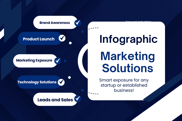
While it’s important to cater to your audience’s interests, your infographic should also align with your business goals. Consider what you want to achieve with your infographic. Is it brand awareness, lead generation, or product promotion? By aligning your topic with your infographic design strategies and objectives, you can ensure that your infographic not only engages your audience but also contributes to your overall business strategy.
Gathering and Presenting Data Effectively
Once you’ve chosen a topic, the next step is gathering and presenting data effectively. The credibility and clarity of your infographic depend heavily on the quality of the data you use and how you present it.
Utilizing Reputable Sources for Data
Data credibility is paramount. Use reputable sources to gather accurate and up-to-date information. Whether it’s industry reports, academic studies, or government publications, ensure that your data comes from reliable sources. Citing these sources not only enhances your infographic’s credibility but also builds trust with your audience.
Remember that effective infographic design strategies, is only as strong as the data it presents. Double-check your sources and verify facts to avoid spreading misinformation.
Avoiding Common Data Presentation Mistakes
Presenting data effectively in an infographic is crucial to ensure that your message is clear and impactful. One common mistake is overloading your infographic with too much information. Remember, less is more. Focus on the key points and avoid cluttering your design with unnecessary details.
Another mistake is failing to organize data logically. Ensure that your information flows in a way that makes sense to the reader. Use visual cues like arrows or numbered sections to guide the audience through the content. This helps maintain clarity and keeps the viewer engaged from start to finish.
Infographic Design Elements That Capture Attention
- Choose a bold and harmonious color scheme.
- Use typography that is easy to read and fits the theme.
- Incorporate relevant icons and imagery to enhance understanding.
- Ensure a balanced layout with ample white space.
Design elements are the backbone of a compelling infographic. A strategic approach to design can significantly enhance the infographic’s ability to capture and hold attention. Start with a bold and harmonious color scheme that aligns with your brand and the infographic’s theme.
Typography is another critical element. Select fonts that are easy to read and appropriate for the content. Avoid using more than two or three different fonts to maintain a cohesive look. Additionally, ensure that your text size is large enough to be legible, even from a distance.
Icons and imagery should complement your message rather than distract from it. Use visuals that are directly related to the content and help explain the data more effectively. Every element should serve a purpose and contribute to the overall narrative of the infographic design strategies.
Color Schemes and Their Impact
Color schemes play a vital role in the effectiveness of an infographic. Colors can evoke emotions and influence how information is perceived. For instance, blue is often associated with trust and professionalism, while red can convey urgency or importance. For more insights, explore infographic design best practices.
When selecting a color scheme, consider the mood you want to set and the message you want to convey. Use contrasting colors to highlight important information and ensure that your text stands out against the background. Tools like Adobe Color can help you create harmonious color palettes that enhance your design.
The Importance of Typography
Typography is more than just choosing a font; it’s about creating a visual hierarchy that guides the reader through your infographic. Use different font sizes and weights to emphasize key points and establish a clear reading order.
Keep your typography consistent throughout the infographic to maintain a professional appearance. Pay attention to spacing and alignment to ensure that your text is easy to read and aesthetically pleasing. Typography should enhance the visual appeal of your infographic while making the content accessible and engaging.
Using Icons and Imagery Wisely
Icons and imagery can transform an infographic from ordinary to extraordinary. They help break down complex information and make it more digestible. However, it’s essential to use them wisely to avoid cluttering your design.
Select icons and images that are relevant to the content and add value to the message. Ensure that they are high quality and consistent in style. Avoid using too many visuals, as this can overwhelm the viewer and detract from the main points. Instead, use them strategically to support and enhance the narrative.
Writing Concise and Compelling Infographic Copy
The copy in your infographic should be concise yet compelling. It should complement the visuals and help convey the message clearly. Avoid lengthy paragraphs and instead, use short, punchy sentences that get to the point quickly.
Every word should have a purpose. Remove any redundant or unnecessary text to keep the focus on the key information. The goal is to communicate effectively and efficiently, so choose your words wisely so that it is fully in tune with the overall infographic design strategies.
Balancing Text and Visual Elements
Finding the right balance between text and visuals is crucial for an effective infographic. Too much text can overwhelm the reader, while too many visuals can dilute the message. Aim for a harmonious blend where each element complements the other.
Consider the main points you want to convey and determine whether text or visuals are the best medium for each. Use text to provide context and explanations, while visuals can illustrate data and concepts. This balance ensures that your infographic is both informative and visually appealing.
Crafting a Memorable Headline
Your infographic’s headline is the first thing people will see, so make it memorable. It should be catchy and convey the essence of the infographic in just a few words. A strong headline can draw in readers and encourage them to explore the content further.
Example: “Unlocking the Secrets of the Universe: A Visual Guide to the Cosmos”
This headline is intriguing and gives a glimpse into the infographic’s subject matter, enticing the audience to learn more.
Placing Strategic Calls to Action (CTAs)
Calls to action (CTAs) are essential for guiding viewers toward a desired outcome, whether it’s visiting a website, signing up for a newsletter, or sharing the infographic. Place CTAs strategically within the infographic to maximize their impact.
Example: “Want to learn more? Visit our website for in-depth articles and exclusive content!”
Your CTAs should be clear, concise, and compelling. Use action-oriented language and ensure that they stand out visually. By directing viewers toward the next step, you can enhance the effectiveness of your infographic and achieve your conversion goals.
Optimizing Infographics for Shareability
Creating a shareable infographic can significantly increase its reach and impact. Consider the platforms where your audience is most active and tailor your design accordingly. A shareable infographic is one that resonates with viewers and encourages them to pass it along.
Formats and Sizes for Different Platforms
Different platforms have varying requirements for image formats and sizes and should be clearly identified within the infographic design strategies. For instance, infographics shared on Instagram should be square, while those on Pinterest perform better in a vertical format. Familiarize yourself with the specifications for each platform to ensure your infographic looks its best wherever it’s shared.
Promotional Strategies for Maximum Reach
Promotion is key to maximizing the reach of your infographic. Share it across your social media channels, include it in your email newsletters, and consider reaching out to influencers in your industry who might be interested in sharing it with their followers. For more insights, check out these infographic best practices to enhance your promotional strategies.
Encourage engagement by asking questions or prompting discussions around the infographic’s content. The more people interact with your infographic, the more visibility it will gain, leading to increased traffic and conversions. For more tips, check out these infographic design best practices.
Incorporating SEO Best Practices
To maximize the reach of your infographic, incorporating SEO best practices is essential. Start by optimizing your infographic’s file name and alt text with relevant keywords. This helps search engines understand the content of your infographic and improves its visibility in search results.
Additionally, create a detailed and keyword-rich description to accompany your infographic when sharing it online. This not only provides context for viewers but also enhances search engine indexing. Ensure that your infographic is hosted on a page with relevant content and metadata to further boost its SEO potential.
Review and Refine: The Iterative Process
Creating a high-converting infographic is an iterative process. After completing your initial design, take the time to review and refine it. Seek feedback from colleagues, peers, or your target audience to gain valuable insights into what works and what doesn’t.
Consider conducting a survey to gather opinions on your infographic’s design, clarity, and overall impact. Use this feedback to make necessary adjustments and improvements, ensuring that your final product is polished and effective.
Conducting Audience Feedback Surveys
Audience feedback surveys can provide invaluable insights into how the implemenntation of your infographic design strategies are perceived. Create a simple survey with questions about the infographic’s design, content, and clarity. Ask respondents to rate their experience and provide suggestions for improvement.
Use the survey results to identify common areas of concern and prioritize changes accordingly. By actively seeking feedback, you can ensure that your infographic meets the needs and expectations of your audience.
Common Mistakes and How to Avoid Them
There are several common mistakes to avoid when planning your infographic design strategies. One major pitfall is overloading the design with too much information, which can overwhelm viewers. Instead, focus on the most important data and present it clearly and concisely.
Another mistake is neglecting the importance of a strong narrative. Your infographic should tell a story that guides the viewer from start to finish. Ensure that the flow of information is logical and cohesive, making it easy for the audience to follow along.
The Role of A/B Testing in Design
A/B testing is a powerful tool for optimizing your infographic design. By creating two versions of your infographic with slight variations, you can test which one performs better in terms of engagement and conversions.
Experiment with different color schemes, layouts, or headlines to determine what resonates most with your audience. Use the insights gained from A/B testing to refine your infographic and maximize its impact.
Frequently Asked Questions (FAQ) About Infographic Design Strategies
Infographics can be a valuable addition to any content strategy, but you may have questions about how to create and use them effectively. Here are some frequently asked questions to help guide you:
How Can Infographics Benefit My Content Strategy?
Infographics can enhance your content strategy by making complex information more accessible and engaging. They can boost user engagement, increase website traffic, and improve brand awareness. By presenting data visually, infographic design strategiess can help convey your message more effectively and encourage social sharing.
What Tools Are Best for Creating Infographics?
There are several tools available for creating infographics, ranging from simple to advanced. Canva and Piktochart are user-friendly options for beginners, while Adobe Illustrator and Visme offer more advanced features for experienced designers. Choose a tool that fits your skill level and design needs.
How Do I Choose the Right Color Scheme?
Choosing the right color scheme involves considering your brand identity and the message you want to convey. Use colors that evoke the desired emotions and ensure they complement each other. Tools like Adobe Color can help you create harmonious color palettes that enhance your infographic’s visual appeal.
What Common Mistakes Should I Avoid?
Common mistakes to avoid include overloading your infographic with information, neglecting a clear narrative, and using inconsistent design elements. Focus on clarity, simplicity, and coherence to create an effective and engaging infographic.
How Can I Ensure My Infographic Is Shareable?
To ensure your infographic is shareable, design it with your target audience and platform specifications in mind. Use a catchy headline, compelling visuals, and concise copy. Promote your infographic across social media channels, email newsletters, and relevant online communities to maximize the effect of your infographic design strategies.
Key Insights On Infographic Design Strategies
- Infographics can boost user engagement and increase website traffic when designed effectively.
- Choosing a topic that aligns with your audience’s interests is crucial for high conversion rates.
- Utilize reputable sources and simplify complex data for clarity and impact.
- Strategic use of color, typography, and imagery can capture and retain attention.
- Incorporate SEO practices to enhance the shareability and reach of your infographics.

Imagine having a team of seasoned professionals dedicated to helping you conquer multichannel organic traffic that includes infographic design strategies. With expertise spanning video production, podcasting, blogging, infographics, and press release distribution, OneStopSolutions has everything you need to expand your digital footprint. We understand that seeing is believing, which is why we’re offering a risk-free consultation of our services.
Experience firsthand how our data-driven strategies can skyrocket your organic traffic and deliver tangible ROI, proving that Infographics are more than just pretty pictures, but exceptionally powerful tools for communication with your target audience.